ShopDreamUp AI ArtDreamUp
Deviation Actions


Description
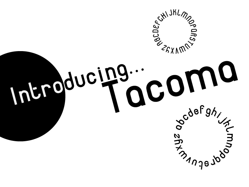
That's my first self-created font !  (Smile)")
Free Download !
For a commercial use, please ask me before...
(...and it took my about 2 complete days to understand how the software works") )
)
Free Download !
For a commercial use, please ask me before...
(...and it took my about 2 complete days to understand how the software works
Comments5
Join the community to add your comment. Already a deviant? Log In
Pretty nice work. I like the 'a'.
Tacoma reminds me of DIN and the font used for The Inbetweeners (though that might have been DIN; I don't quite remember). I think it's a pity that you introduce a stencil-like effect in a few characters though (e, f, t). I personally don't like stencil effects too much, but I think you should either apply it to all the letters or none of them.
I'm also uncertain about the design of 'k'. I think it looks beautiful but it's not consistent. If you apply the stencil effect to all letters then I think the fact that the 'k' consists of two shapes will be consistent with the typeface; right now it isn't.
Also, rounded characters look optically smaller so you have to account for that. The principle is explained here: [link]